The Great Branding Disaster
I originally titled this “The Great Logo Disaster” because that is how the story started. However, as the story unfolded (unraveled?) it became clear that the logo was only the starting point for a line of mistakes that ultimately might be costly as a great branding disaster.
We are working on a political campaign (by “we,” I mean BackBurner Marketing, my creative marketing consulting company) here in Florida. We were brought on to handle the candidate’s image marketing issues–logo/signage/website development, message/platform structuring and development, public and media relations, copywriting for op-eds, speeches, etc. Before we came on scene, this was all handled ad hoc by a group of well-meaning volunteers who have a lot of energy and enthusiasm but virtually no experience in real-world marketing, and certainly not in the kind of concentrated branding that is an election campaign.

A political campaign is really brand development on steroids.
The market lifespan is very short, the product development period is even shorter. As a marketer, you have to quickly evaluate your candidate–a.k.a. the product–and develop a positioning strategy vis-a-vis the other candidates and the issues the voters care about (a.k.a. the marketplace).
While there are a lot of nuances that are unique to political campaigns, the truth is that campaign marketing is really not all that different from any other kind of product marketing. You are selling the embodiment of the job in the form of a person. In effect, you are selling a metaphor: Joe Politician is the very picture of the perfect Councilman.
We got in the game late.
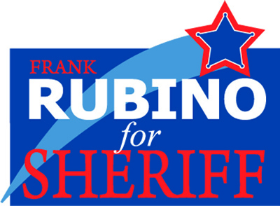
It is kind of like being hired to coach a football team just before mid-season with only a few players able to take the field. You can try, but it’s an uphill battle. But, we jumped in and developed a decent campaign logo, backed by a lot of visual psychology and symbolism. Next, we hammered out a slogan that resonated with the campaign staff, the candidate and brought good reactions from audiences. We designed business cards, flyers, handouts, door hangers, signage, and a website. We redefined some of the candidate’s platform to align him better with the large and powerful senior citizen’s bloc (it is Florida, remember). All was going well…right?
Well, no. And here is where the great branding disaster started. There was some in-fighting among the inner circle of volunteers as to who would be the campaign manager. As a consulting company, we stayed out of it, but cautioned the candidate that it was critical that there be management of his image materials so that his “brand” would grow in stature and become as much of a household name as possible before the primary. We offered to manage this aspect of the campaign but didn’t want to handle the volunteers and events since that was already under the purview of several of the battling factions.
What’s wrong with this elevator?
The great elevator dropping feeling came when someone emailed that campaign signage was ready for pickup. “Huh?” we said back in the office. No one remembered sending the sign design to the printer, and the roughs that had been approved were kind of low-res for that sort of application. After a few emails, it was learned that the sign design was actually NOT the approved design but one that was a home-spun back-of-napkin doodle that was in use when we came on the scene. Two-thousand signs will dot the local landscape, all with the wrong colors, wrong typeface, wrong logo, wrong EVERYTHING! They will contrast with the website, door hangers, business cards…well, you get the idea. A great branding disaster!
“Oh, crap,” we said.
Worse still, another email arrived just as we figured out the sign disaster. The two giant vinyl-clad buses that the campaign had been donated were out on the streets with yet ANOTHER logo and signage design.
“Oh, crap,” we said again. That was our slogan for the day.
And here is where anyone in marketing and advertising sees all the nightmares from his past crawl out from under the bed. As in any organization, a campaign is a mish-mash of personalities and agendas. If you’ve ever worked in or with a large corporation (or, worse still, a major university), you know that not only are there a hundred opinions on how to do things but there are also active coalitions of persons determined to destroy the work you’ve done in favor of their own anecdotally-proven superior ideas. It’s an old story.
This is why, as consultants, we do our best to get our clients to allow us to MANAGE their identities. Let us handle the cards, the signage, the website, and then we will give you a guidebook as to how to use the logo. Pretty simple in concept, but, as we all know, once the controlling body is out of view all hell breaks loose and suddenly the logo changes colors, appears upside down and backwards on stationary, and a new mascot appears that looks remarkably like someone in one of the evil coalitions hand-drawn doodle that was rejected months earlier. Revenge is a dish best served cold.
So, how did this happen in our story? It turns out that the original design for the logo that was rejected was created by a local sign company. The vehicles that were donated for publicity were given by the brother of the sign guy. The sign guy decided to stick his own logo design on the buses despite there being a new and approved version in use.
What does it mean?
I don’t know yet. In the best case, the voters will see a bunch of different signs and logos and remember the candidates name and, on election day, will go to the polls and vote the way they should (in our opinion, that is). Realistically, that’s not how it will play out. Those of us who have been in the identity biz for a while know that confusion in identity can lead to aversion by the buyer (voter, in this scenario). He or she will go for the product (candidate) with the strongest image, the most powerful brand identity. All our work will be for nothing. Sure, the candidate has a really good website and logo and stationary, but the overall image is damaged. Irreparably, as it happens, since the campaign cycle is so short.
We can only hope that the slogan (which is not on the bus or signs, by the way) and the great op-eds and speeches will galvanize the voters into voting for our guy. He’s a great person, we think, and far more qualified for the job than his opponents. Sadly, the lack of a firm, hands-on control center for image-related issues allows less qualified candidates to use the very tools we are hired to implement–branding, identity marketing, consistency of message–to convince a not-so-discriminating public that quality is determined by image.
But, to be honest, that’s what we sell, too, so I can’t really complain. In the end, the concepts we talk about prove to be true. I just wish I could talk about the major screw-up on the OTHER side of the fence…